Tottenham Hotspur unveils a heraldic identity

Tottenham Hotspur has revealed new branding after a nine-month redesign process in collaboration with London-based agency Nomad.
The football club’s classic cockerel crest has been subtly revised in collaboration with designer Chris Mitchell, who worked on the substantial redesign of the badge back in 2006. The club’s name has been removed from the crest, leaving it to stand on its own rather than as part of a lockup.
The crest comes in two versions: a silhouetted ‘brand logo’ that images suggest will be used in contexts like brand campaigns and stadium signage, plus a slightly more detailed ‘club logo’ that seems like it will be used in more everyday settings such as matches. Time will tell whether having two badges will be effective or confusing.
While the two badges exist primarily as flat designs, the cockerel motif is also expressed in a range of 3D textural versions, which were likely designed to bring some modern energy but seem somewhat incongruous with all the references to heritage.
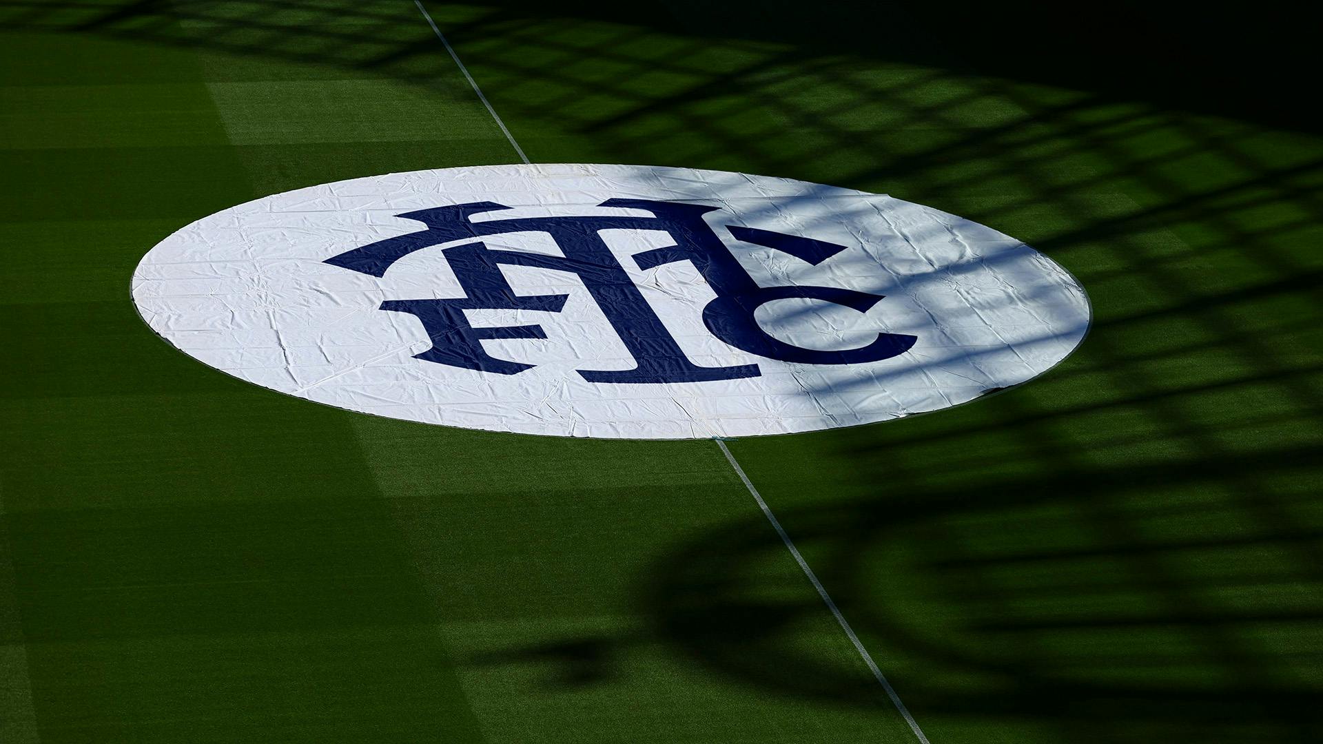
On top of this is the reintroduction of a ‘THFC’ monogram designed in collaboration with type specialist Miles Newlyn. It is based on the historic design that used to appear in the club’s old stadium and formed part of the crest from the 1980s until the 2006 redesign.
The emphasis on history also manifests in a series of heraldic icons drawn from the club’s heritage and geographic roots, such as its founding year of 1882, the Seven Sisters trees, and Bruce Castle.
These historic cues have also fed into the palette. The club’s core navy and white is joined by secondary colours that take inspirations like brickwork and plant life and amplify them into vibrant hues.
The agency worked with type foundry F37 to rework and extend the club’s existing display typeface into a suite of fonts, which neatly echo other design details like the curvatures of its crest. The new typographic system involves variable fonts and a mixture of ligatures, italics and reverse italics, which allows variety and complexity but may also require a careful hand in practice so as to remain looking sharp rather than messy.
Though having different ways of representing the club offers flexibility, the new design system bucks the prevailing logic adopted by some other clubs: that unifying and simplifying design systems is the way to go, particularly as the line between club and brand become increasingly (and intentionally) blurred.